Remember: Vote for the COVER, not the story or the author.
*Another highly competitive category. There are six covers for you to vote on.
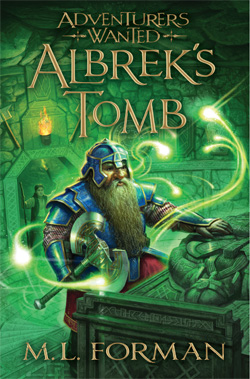
Albrek’s Tomb by M.L. Forman
Publisher: Shadow Mountain
Cover Designer:
I love the color of this book. It’s just…green. And gorgeous! I like the font choice for the title and the letters are differing sizes. It makes the title itself a piece of art. I also like the magic lights swishing around the dwarf. And I like that it’s a TOMB. I mean, if the book is called Albrek’s Tomb, the cover image should be a tomb, right?
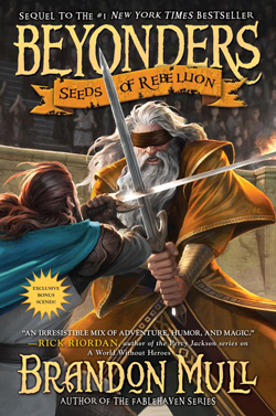
Beyonders: Seeds of Rebellion by Brandon Mull
Publisher: Aladdin
Cover Designer: Lisa Vega?
I liked the first Beyonders cover, but I like this one even better. A sword fight where one guy is blindfolded? Intriguing. And you know this art work was created just for this story. The colors pop. The swords cut across the image, slicing it in half. The title almost gets lost in the image, but I don’t even care because the action pulls me to the book.
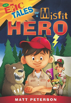
The Epic Tales of a Misfit Hero by Matt Peterson
Publisher: Cedar Fort
Cover Designer: Angela D. Olsen
Cover Artist: Neil Robinson
I like this cartoony/paper cut-out style. It’s different and fresh. It’s also the only non-fantasy cover in this category. I guess you can see where my taste runs. I love that the main character is front and center, with the bear and the storm behind him. I also love the other scouts shown. Caricature at its best!
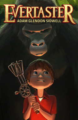
Evertaster by Adam Glendon Sidwell
Publisher: Future House Publishing
Cover Designer: Goro Fujita
I haven’t read this book yet, but there is just something so haunting and intriguing about this cover. I like the style of the artwork, the use of light. I like that the title is prominent but doesn’t overshadow the artwork, and I like that the author’s name is tucked in under the title. For a book like this, and for grabbing the attention of middle grade readers, the author’s name is not nearly as important as the title and the image. As I had the various covers up on my computer screen side-by-side, my eyes just kept returning to this image. I could not NOT look at it. That’s why it got my vote in this category.
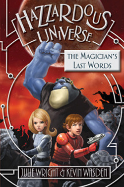
The Magicians’s Last Word by Julie Wright
Publisher: Covenant
Cover Designer:
Cover Art: Kevin Wasden
I love the almost retro look to this cover, particularly the two main characters. Sort of late 50s, early 60s feel to it. I’m probably telling my age here, but it made me all nostalgic. But does it work in 2012? Yes! I tested it out on some kids, ages 6 to 12. They loved it. Of course, their eyes went to the blue guy first, but they all said they liked the space suits the kids are wearing. They and I also liked the circuit board design and how it carried through on the internal pages of the book. The only downside for me is the silver gray title box. I might have moved that down toward the bottom of the cover.

One Boy, No Water by Lehua Parker
Publisher: Jolly Fish Press
Cover Art: Corey Egbert
Remember the green cover? Well, this one is blue! I’m amazed by how much can be done with one color. I love it. I love the boy in the center, the Hawaiian frame around him, the water shark rising up to get him. I like the title in the oval at the top. I like the look of the font (although it loses points because I can’ tell what that first letter is…”N”?). And I like that splash of yellow. Great cover!
Epic Tales of a Misfit hero