Please vote for your favorite cover using the poll at the bottom of the post.
Remember: Vote for the COVER, not the story or the author.
Voting deadline: Midnight, Saturday, January 26, 2012.
Have you noticed a trend in mystery covers? A lot of them use frayed fonts—meaning, the font has frayed edges, or cut outs, or holes in them. I noticed it for both this category and the romantic suspense category. Not sure what I think of it yet but in these examples, it looks pretty cool.
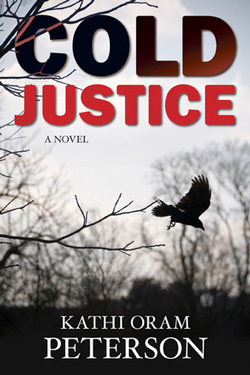
Cold Justice by Kathi Oram Peterson
Publisher: Covenant
Cover Designer: ??
This is a great cover for setting a mood with image and cover. It makes me shiver! Great font choice and placement for title. I like the way it goes from cold black to red. The image itself is just so hopeless and depressing. But in a good way. And at the bottom of the cover, we go back to the cold, dead, bleak black. Awesome!
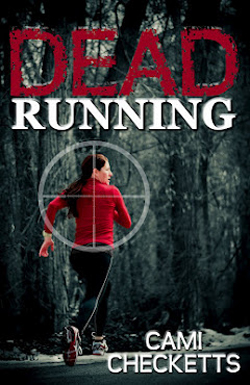
Dead Running by Cami Checketts
Publisher: Birch River
Cover Designer: Janna Barlow
(Notice the font?) I really like that Dead red font. It gives me the feeling of dripping blood without the actual dripping blood. I love the simpleness of the author font. I like the red of the shirt. But the thing that really won me over in this cover? The cross-hairs. Those cross-hairs sealed the deal for me. A great example of a suspense cover!
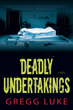
Publisher: Covenant
Cover Designer: ??
(Again, notice the font.) This is not my favorite Gregg Luke cover but it is pretty cool. I like the play on the words for the title. And the font and color choice. I have no idea what embalming fluid looks like, but I’m pretty sure I’d believe it if someone told me it was that sickly green color from the title. I like that the author’s name pops in red, but doesn’t take over the cover. The image itself doesn’t scream “suspense” to me. It’s almost too clean and clinical. But coupled with the title, it works.
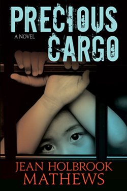
Precious Cargo by Jean Holbrook Mathews
Publisher: Covenant
Cover Designer: ??
(See font.) While this cover doesn’t scream suspense at me either, there is something very haunting about that child’s face. And the font almost looks like it’s been shot up by bullets. I love the dark background behind the image and the colors used in both the title and the author’s name. It really made me look closely, pulled me in. Great job.
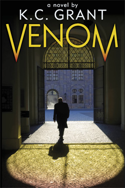
Venom by K.C. Grant
Publisher: Covenant
Cover Designer: ??
This was a cover that I remembered from way back in January. I loved it then, I love it now. I love the font and color choices of the title. I like the artistry of the V and the M. I like that the placement of the author’s name doesn’t interfere with the image of the cover. I love the loneliness of the man and the way the colors and shadows stream out behind him. I love that you can’t really see him clearly due to the size. I love the warmth of the yellows and the cool of the blues and grays. But. And this is the one thing that kept it from being my first choice for this category—that image doesn’t really say mystery or suspense to me. It needs some little something to twist the suspense. But otherwise, great cover!
Thank you! That’s quite an honor.
Warmest wishes,
Cami