Please vote for your favorite cover using the poll at the bottom of the post.
Remember: Vote for the COVER, not the story or the author.
Voting deadline: Midnight, Saturday, January 26, 2012.
*Note: This is the more traditional romance category.
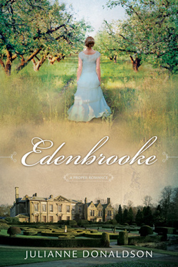
Publisher: Shadow Mountain
Cover Designer: ??
This cover got a lot of reader nominations. I like this cover, but it’s almost too busy. I really like the image at the top—it whispers soft romance. And I like the image at the bottom. It places us in a time period. I like the title font, it’s nice and swirly and romantic. But. All together on the same cover is too much for me. I lose the title because my eye is too busy jumping from the top image to the bottom image. And when it finally settles, it’s the author’s name at the bottom that carries the weight. Not sure that’s the best thing for a lesser known author.
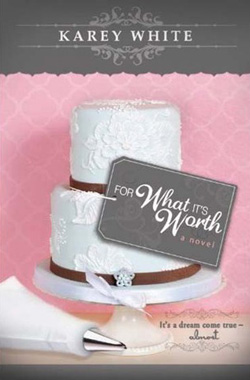
Publisher: Cedar Fort
Cover Designer: Erica Dixon
I love this cover. Everything about it speaks romance to me. I love the colors of it, the pretty pink contrasted with the gray. I like that the author’s name is set off up there at the top, where you can notice it and then ignore it while you look at the cake. I love the wedding cake image with the tag for the title. I like the font choices and they way they’re used in an artistic manner. I even like that little blurb at the bottom in the swirly border. Of all of the romance covers, this is my favorite!
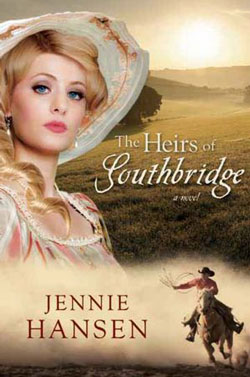
Publisher: Covenant
Cover Designer: ??
Another cover that got a lot of reader nominations. Like the Edenbrook cover, I like the different elements of this cover, but all of them together are almost overwhelming. I’m not sure I like that cover model but she certainly gets my attention. The title is almost too small and gets lost in the background. I do like that cowboy, but not sure I’d put him there. The one difference between this one and Edenbrooke is that Jennie Hansen is a popular enough writer that her name will help sell the book. So having it be one of the main focal points of the cover works.
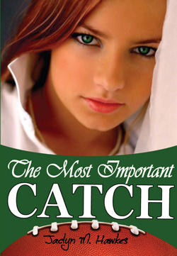
Publisher: Spirit Dance Books
Cover Designer: Thomas Gasu
I really like this cover. You have a very pretty girl as the main focus of the cover. That’s good. If you’re going to have a face that big on the cover, it needs to be attractive. The title stands out well in that green stripe and I like that “Catch” is emphasized. I also like that the curve in the green is a mirror of the football image below it. The author’s name gets lost a little, but it’s okay. You can still see it. The cover seems to flow from the girls eyes, down to the football. It’s nice and smooth to my eye. I like it.

Publisher: Cedar Fort
Cover Designer: Rebecca Jensen
I love this cover too. Another good example of an attractive girl as the focal point. I really like all that swirly filigree around the edges. It softens it and gives it an air of romance. I really like the placement of the title, the big P and the green background of the box that you can still sort of see through. (Not really, but it feels like you can see through it.) Author’s name is just right in size and placement, as is the blurb to the left of the girl’s face. Caught my eye.
Not a huge Romance fan, but they all have great covers. For What It’s Worth looks like it would be really fun to read. Love the cover.