Please vote for your favorite cover using the poll at the bottom of the post.
Remember: Vote for the COVER, not the story or the author.
Voting deadline: Midnight, Saturday, January 26, 2012.
Publisher: Shadow Mountain
Cover Designer:
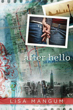
I like the elements of this cover. I like the background image—the colors and the fadedness of it. I like the red stripe with the author’s name and the red swirly thing off to the side. I like the photographs. I like the simple font choice of the title. But in many ways, this one has too many things to look at. It’s too busy and makes my eye jump around all over the place. Having read this book, I understand that this was most likely intentional. And as a big blurry unit, yes, it caught my eye in the bookstore and I picked it up for a closer look. That’s what a cover is supposed to do. But once I started looking at the individual elements, I was less captivated. It’s almost like it’s trying too hard. And yet…it still catches my eye every time I walk past it in a bookstore…
Altercation by Tamara Hart Heiner
Publisher: WiDo Publishing
Cover Designer:
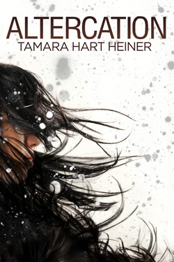
This book cover is a perfect example of how much a cover can influence a reader’s decision to buy or read a book. Have you seen the first cover for this book? No? Click here to see it. Other than the coolness of the hand and the trees, there’s really nothing in that old cover that would make me give that book a second look. And while this cover doesn’t do much to develop the theme of the story or give you any hints as to what the story is about, it’s still 100% captivating to me! There is just so much action in that image, so much movement. I’m intrigued. And the straightforward title and author font frames it rather than distracts from it. And that is why I picked it as my winner.
The Breakaway by Michelle Davidson Argyle
Publisher: Rhemalda Publishing
Cover Designer: Melissa Williams
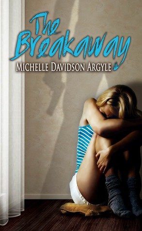
This was my very close second choice. There is just something so menacing about that man’s shadow on the wall behind this girl. I want to know the story behind it. I want to know what happens to her. I’m not sure the title font is a choice I would have gone with (it seems almost too light and fun for the image, which is what made this a close 2nd) but I do like that it picked up the blue from her shirt and sort of ties it to the image. Great cover.
Finding June by Shannen Crane Camp
Publisher: Sugar Coated Press
Cover Designer: Jackie Hicken
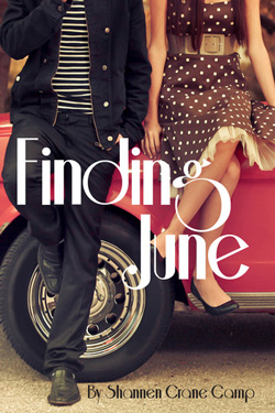
I love this cover. It is such a fun and colorful image and fun font. It just feels light and fresh and … fun! Yes, fun. I’ve read the book and it wasn’t what I expected from the cover, but it is still a great cover and it got my attention and held it for awhile. Sometimes I don’t like the current trend of cutting off heads from a cover image, but it worked for me in this one. I would, however, have chosen a plainer font for the author’s name.
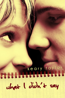
What I Didn’t Say by Keary Taylor
Publisher: Keary Taylor
Cover Designer:
Yellow! I love it! I love the faces of these two people on this cover. They are so full of life and love and I want to know their story. Great way to set off the title with a spiral notebook—places us right in YA territory. Good font choices for both the title and the author’s name. Clean, simple, fresh.
One thought on “2012 YA General Book Covers”
Comments are closed.