2011 YA Speculative Book Covers (Boys)

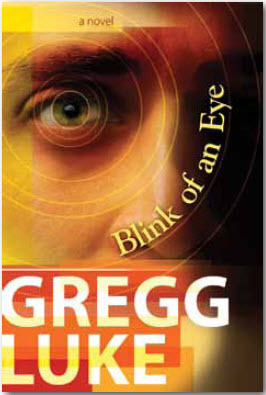
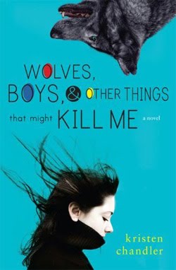
And by “boy” I mean these covers are more masculine and straightforward,
without a lot of the fluff you’ll see on books targeted to girls.

Please vote for your favorite cover using the poll at the bottom of the post. 

Remember, we’re voting for the COVER, not the story or the author.  
Voting deadline: Midnight, Friday, February 10, 2012.


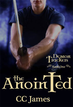
The Anointed by  C.C. James
Publisher: Red Rover Books
Cover Design: ??
*This is the original cover, I think. If you click the link,
it goes to a different cover which I do not like as well.

Look at those arms. Every guy wants to have arms like those, and every girl wants a boyfriend with arms like those. Okay, my shallowness is showing, but still. Great cover image. I really like how the top of his head is cut off so I can imagine my own face. (That sounds sarcastic, but I’m serious.) I like the blue swirly smoke behind him. I love the font choice and the way the title pops in that dark black. Great cover. (And really, if you are the one making the decisions, please go back to this cover instead of the other one. Please.)

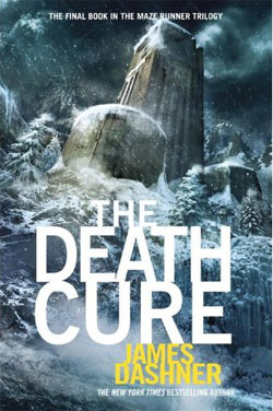
The Death Cure  by  James Dashner
Publisher: Delacorte
Cover Design: Philip Straub

At the risk of re-appalling some readers, this is totally a boy cover. My grandson thinks it’s awesome! My granddaughter says, “meh.” I tested it with some neighbor kids and got the same reaction every time. Which is really too bad because I think girls who actually read it will love the story too. What I like about this cover (even though I’m a girl) is the feeling that I’m about to be crushed. Those towers are so high, and the mountain so steep. And then the title and author’s name are so solid and heavy. The fonts are solid too. I personally love it and think it’s the best cover of the series.
 

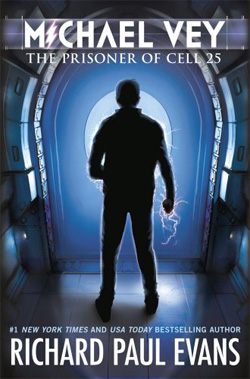
 Michael Vey: The Prisoner of Cell 25 by  Richard Paul Evans
Publisher: Mercury Ink
Cover Design: ??

I like the clean and isolated feeling of this cover. It matches the subtitle. I like the I in Michael that mirrors the electricity coming off the figure. I like that the young man is in shadow. I like the blues and grays together. It feels sterile and electrical. Very good choices.

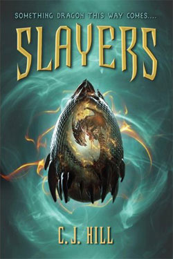
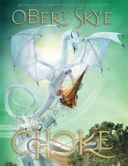
 Slayers by C.J. Hill
Publisher: Feiwel & Friends
Cover Design: ??

I thought this cover was totally cool when I first saw it, even if I had no clue what the illustration actually was. I thought it was a spaceship at first. But when I picked up the book and studied it (yes, it was cool enough to get me to pick it up) I realized that’s a dragon in there. Awesome! I like the font work for Slayers. I like the tag line at the top that you almost miss, but not quite. Sort of a whisper of a warning. Cool. Love it.
Variant by Robison Wells
Publisher: HarperTeen
Cover Design: ??

I’m not even sure I can verbalize what I love about this cover. When I first saw it, I thought, “What? Huh?” Normally, I don’t go for the blurry stuff. And it’s all blue-ish and sort of almost creepy. But. The red in the girls sweater caught my eye. That was kind of awesome. Then I noticed that the boy seems to be running, but the girl is looking behind, like she’s afraid someone or something is after her. Intriguing. And where are they headed in that blurry forest? What’s with that? And “Variant”? What does that mean? And the title is shadowy. You can see through it. It sort of blends, but not quite. That’s cool. Is that a hint for the story? And then. And then. “TRUST NO ONE.” That got me. Hook. Line. Sinker. The tag line pulled all the other items together for me in a way that I had to go get this book. I had to know what was going on in this story. Great, great job of reeling me in!

2011 YA General Book Covers

Please vote for your favorite cover using the poll at the bottom of the post. 
Remember, we’re voting for the COVER, not the story or the author.  
Voting deadline: Midnight, Friday, February 10, 2012.
Publisher: Dutton Juvenile
Cover Design: Abby Kuperstock
I love everything about this cover! I love the colors—the hot pink and blue and green. I love the way the books are subdued and faded, while the illustration of the girl and boy legs pop. And the pink! I love the way the girl is up on her toe, with that one leg lifting behind her just a bit. I love those pink tennies. (I want a pair.) I love the little cloud in the middle with the title in a font that looks like a girls handwriting. I love the way the author’s name is on the stool. Everything about this cover just speaks to me. Very appealing to the target reader. And pink! Did I mention the cute pink?! 
Publisher: Cedar Fort
Cover Design: Angela D. Olsen
This cover is just all sorts of awesome. It was a very close call for me between this one and the one above. I love the red and black together. It’s strong and powerful. The girl’s face is strong and powerful. I love the skull in the heart. And I love the way the title is done. The author’s name is in the right spot to balance the rest of the cover. Very, very good. I bought it based on the cover. Yes, I did. 
Publisher: Cedar Fort
Cover Design: Angela D. Olsen
The best thing about this cover is how it goes from very soft and romantic at the top to darker and more intense at the bottom. I love that. It’s sort of like moving from the fantasy of being in love into the sometimes difficult consequences of real life. Good flow bringing your eye down to the central image at the bottom, without rushing past the title. I like the variation in the font for the title.  It’s pretty and it feels right. I like the image of the cover and the way the sun creates a halo around them. Good job. 
Publisher: Cedar For
Cover Design: Danie Romrell
I like the main image of the girl being full color and solid. There she is, rooted in the present. I love the girl. I love the expression in her eyes, that deep in thought look. I like that whispery wagon wheel at the top, a faded reality that’s already in the past. I like the torn journal page that frames the title and author name, and an image from the past is echoed at the bottom. I like the two font choices for the title, especially the “rock”—that is visually cool. 
Publisher:  St. Martin’s Griffin
Cover Design: ??
This cover prompts questions in my mind. Her face is hidden, both by her hair and the cropping of the image, but her mouth is open that makes me think she’s confused or in shock. I want to know why. She looks like a regular girl—not drop-dead gorgeous. Just plain and ordinary. But the title is Miles from Ordinary. Hmmm. Intriguing. I like that a relatively ordinary font was chosen for the title, but it’s just a little different…a little rounder on the edges, a little taller. Not quite ordinary. All of that pulls me in and makes me want to know her story. (In this image, the author’s name gets lost on the cover, but it pops just enough on the real cover.)

2011 Speculative Book Covers

Please vote for your favorite cover using the poll at the bottom of the post. 
Remember, we’re voting for the COVER, not the story or the author.  
Voting deadline: Midnight, Friday, February 10, 2012.

Embers of Atlantis by Tracy Hickman
Publisher: Fantasy Flight Games
Cover Design: Mathias Kollros

What I like most about this cover are the colors. The top is a little busy for my tastes and the title feels like an afterthought. But the colors? They are really breathtaking. I could do without the super short outfit on the woman (personal taste) but that dragon behind her is really spectacular. Love it.

The Last Archangel  by Michael D. Young
Publisher: Cedar Fort
Cover Design: Angela Olsen

I really like the colors in this cover too. Again, the top feels busy to me, and there are so many images shoved in there that my eye doesn’t really know what to look at. But the swords pop out to me. I like that they almost seem to be the hands on the clock. I like that there’s a the hint of dark wings. And I really like the way the title was handled. Intriguing.

 Monster Hunter Alpha by Larry Correia
Publisher: Baen
Cover Design: ??

I love, love, love this cover. First, the title pops. Great color against the gray blue tone of the illustration. While I don’t like to see those bursts on the front telling me how cool the author is, if you have to have one, this one is tolerable. I like the placement and type of the authors name. But the thing that really grabs me is that illustration. I love it! There’s the wolf and the monster girl. And what the heck is that thing in the middle with the metal claws? COOL! I am so tired of sparkly, sexy vampires and hot, hot werewolves. I am thrilled to see the implied violence and animal rage depicted in these monsters. But even without the comparison to wimpy monsters, this cover still totally rocks. Awesome! Love it! Love it!

Perdition’s Gateway  by Terrance Drake
Publisher: Cedar Fort
Cover Design: Angela D. Olsen

I love this cover. It is just awesome. I have no idea what the book is about but it looks so cool that, yes, it’s on my To Read list. Okay, where to start? I like that light at the top that reflects into the dark. Don’t know what it is supposed to be but visually? Cool. I like that it repeats just above the center mark of the cover, but it overshadowed by the title. I love the change in fonts for the title. The red for Perdition. Awesome. And the white of Gateway. Cool. And then there’s the figure there at the gateway. But are they coming or going? Good job.

Wolfhound by Kindal Debenham
Publisher: Wandering Leaf Publishing
Cover Design: Paul Hamblin

This reminds me of some of the classic sci-fi covers from a few years back—but not in a bad, outdated way. I like it. You’ve got the planets and the star ship. Then the characters. I like the colors. Not sure I would use yellow for title and author, and I’d make the title a little more distinct and bold. I really, really like that the woman looks strong, like she can totally kick butt without even breaking a sweat. (Girl power!) Good placement of elements, nice balance, great colors.


2011 Romantic Comedy Book Covers

Please vote for your favorite cover using the poll at the bottom of the post. 
Remember, we’re voting for the COVER, not the story or the author.  
Voting deadline: Midnight, Friday, February 10, 2012.
Publisher: Word Garden Press
Cover Design: ??
Publisher: Cedar Fort
Cover Design: Danie Romrell
Publisher: Cedar Fort
Cover Design: Angela D. Olsen
Publisher: Covenant
Cover Design: Jennie Williams
Publisher: Covenant
Cover Design: Christina Marcano

2011 Romance Book Covers

Please vote for your favorite cover using the poll at the bottom of the post. 
Remember, we’re voting for the COVER, not the story or the author.  
Voting deadline: Midnight, Friday, February 10, 2012.

Before I Say Goodbye by Rachel Ann Nunes

Publisher: Deseret Book
Cover Design: ??

Hearts Through Time by  Marie Higgins

Publisher:  Walnut Springs
Cover Design: Amy Orton

 The Kissing Tree by Prudence Bice

Publisher: Cedar Fort
Cover Design: Angela D. Olsen

The Kiss of a Stranger by Sarah M. Eden

Publisher: Covenant
Cover Design: ??
Publisher: Distractions Ink
Cover Design: Shery L. Brady, 
MightyPhoenixDesignStudio.com

2011 Cozy Mystery/Romantic Suspense Book Covers

Please vote for your favorite cover using the poll at the bottom of the post. 
Remember, we’re voting for the COVER, not the story or the author.  
Voting deadline: Midnight, Friday, February 10, 2012.

Blackberry Crumble by Josi S. Kilpack
Publisher: Deseret Book
Cover Design: ??

Garden Plot by  Kristen McKendry
Publisher: Covenant
Cover Design: ??

Identity by  Betsy Love
Publisher: Walnut Springs Press
Cover Design: Amy Orton

NYC: Murder Brooklyn Style by Loraine Scott
Publisher: American Fork Arts Council Press
Cover Design: Daniel Silva

Ribbon of Darkness by Julie Coulter Bellon
Publisher: Julie Bellon
Cover Design: Crystal Liechty

2011 Mystery/Suspense Book Covers

Please vote for your favorite cover using the poll at the bottom of the post. 
Remember, we’re voting for the COVER, not the story or the author.  
Voting deadline: Midnight, Friday, February 10, 2012.
   
   
Publisher: Covenant
Cover Design: ??
   
   
The Hainan Incident  by  D.M. Coffman
Publisher: Covenant
Cover Design: ??
  
    
Publisher: Covenant
Cover Design: ??
   
   
Publisher: Covenant
Cover Design: ??
  
   
Publisher: Cedar Fort
Cover Design: Danie Romrell

2011 Historical Book Covers

Please vote for your favorite cover using the poll at the bottom of the post. 
Remember, we’re voting for the COVER, not the story or the author.  
Voting deadline: Midnight, Friday, February 10, 2012.

Publisher: Cedar Fort   
Cover Design: Danie Romrell
Publisher: Covenant
Cover Design:  ??
The Frozen Trail by Lisa Dayley
Publisher: WiDo
Cover Design: Tom Milan

The Tomb Builder by E. James Harrison
Publisher: Cedar Fort
Cover Design: Angela D. Olsen
Publisher: Cedar Fort
Cover Design: Angela D. Olsen

2011 General/Women’s Book Covers

Please vote for your favorite cover using the poll at the bottom of the post. 
Remember, we’re voting for the COVER, not the story or the author.  
Voting deadline: Midnight, Friday, February 10, 2012.
Publisher: Daniel Coleman
(Temporarily unavailable;
will be back on market end of February.)
Cover Design: Jodie Coleman
When someone calls something breathtaking, they don’t usually mean the lost their breath, but when I saw this cover for the first time, I literally stopped breathing for a few seconds. It impressed me that much. First the title, Gifts and Consequences. The font work is exceptional. I love the choices on those, the little doo-dahs on Gifts make it light and fun and happy. But then there’s Consequences—heavy, difficult, maybe too much to bear. Can gifts really carry heavy consequences? It made me ponder. Then the central image of the man. He looks so tired, so burdened by life. I love that we can’t see his face, only his stooped shoulders. The overall dark and gloomy colors support that. But then there are the daisies—that little hint of yellow. It made me feel that even in the most difficult of times, hope cannot completely be erased. Beautiful, beautiful cover work. Inspiring all by itself. I made the mistake of not buying the book right away and now it’s temporarily unavailable. Cannot wait until it’s back up for sale later this month. I will be getting it. I have to know the story behind that image. Have to. (And Daniel, do NOT mess with that cover! IF it comes back with a different cover, I will not buy it!)
Publisher: B10 Mediaworx
Cover Design: Adam K. K. Figueira

Another cover where I love the symbolism. The story of Mary Magdalene is one of a fallen woman redeemed, of something beautiful being created from the trials of life. I assume that by using the title Magdalene, we are to recall that and apply it to this story. It certainly fits the cover image—an item of great beauty (the rose) being created by the forge of heaven. I absolutely love it. The black background makes it pop. I love how the molten steel (gold?) is so hot it turns bright white just before it becomes the rose. That is an image for earthly trials, isn’t it? I probably would have done something different with the title font, maybe a script, but as it is, it’s plain enough that your eye can ignore it if you choose to. Great imagery; great work.
 Publisher: Torrey House Press
Cover Design: Jeff Fuller, Crescent Moon Communications
This cover absolutely fits the title. The image above the blue line is what I think of when I think of Moab—all those cave paintings. I don’t love the landscape below the blue but I like that it’s a different shade of brown. The thing that I love most about this is that blue line. It’s so attractive and provides both a base for the figure to stand on and a sense of sky above the landscape. Every time I scroll through the LDS Fiction site, I have to stop and just look at this one. Good work.
 The Shaken Earth by  Toni Sorenson
Publisher: Cedar Fort
Cover Design: ??
I love the colors in this image. Beautiful, vibrant. A patchwork, like the earth when seen from an airplane. I like that the pieces of that building don’t line up, that it’s “shaken.” And I like the solidness of the the title fonts—definitely not shaken.  This is so intriguing. I first saw it at the bookstore and had to do a double take. Love it.


Publisher: Cedar Fort
Cover Design: Danie Romrell
There is something so sweet and lovely about this cover, and a bit ethereal—as is a new baby from heaven. I love the image of the baby. I love the lace work at the bottom. I love the color used in the title font. Every time I see it, it just makes me go, “awwwwwwww”. Cute!

2011 Book Cover Contest

It’s time for our 3rd Annual Book Cover Contest here at LDS Publisher—and WOW! Was it ever hard to narrow it down this year! Not only were there more book covers to look at, but there were so many covers that were really, really good.

However, I forced myself to narrow the finalists down to five per category. Anything to make your voting experience easier. (Yes, that was tongue-in-cheek.)

I’ve changed things up a bit based on the three most frequent comments I received during the past two contests. Which were:

  • Why can’t we, your faithful readers, nominate covers? Starting this year, you could. What? You missed that announcement? It was right here. Yes, you only had a week to nominate. I’ll try to give you more time next year. I gave every nominated cover extra consideration, even if it wasn’t one that caught my eye. Not every cover that was nominated made the final genre cut. To make the cut, either I agreed with you that it was a good cover, or the cover received multiple nominations.
          
  • When the genre category is so diverse, how do you possibly choose between covers? This was most often an issue for the mystery category (standard mystery/suspense vs cozy mysteries) and the romance category (traditional vs romantic comedy), although it did pop up a bit for other categories, too. So, I’ve added more categories this year. We’ll see how it works.
          
  • Eek! I didn’t have enough time to vote in every category. Can you spread it out a little instead of doing it all on one day? Sure. No problem.

Posting & Voting Schedule:

Feb 2: General & Historical
Feb 3: Mystery/Suspense & Cozy Mysteries/Romantic Suspense
Feb 4: Romance (Traditional) & Romantic Comedy
Feb 6: Speculative (Adult) & Young Adult General
Feb 7: Young Adult Speculative (Boys) & Young Adult Speculative (Girls)
Feb 8: Middle Grade Fantasy & Middle Grade Realistic
Feb 10: Genre Voting Ends at Midnight

Feb 13: Genre Winners Posted & Voting Begins on Overall Best Cover
Feb 15: Overall Best Cover Voting Ends at Midnight

Feb 17: Overall Winner Posted

For those of you who are new to this contest…

I’ve divided the covers into 12 genres, each genre with its own post page.

I’ve picked my top five favs (or nominated favorites) for each genre and posted them in alphabetical order.

Covers were picked based on how attractive I thought they were, and how well they communicated the feeling of the genre and the title. It had nothing to do with what is actually inside the book.

My personal tastes lean toward a cleaner look. I don’t like cluttered or fuzzy images. I like all styles—photographic, artistic, and clip art. I don’t care how big the title and/or author name is but it has to blend well with the image and not detract from it. I really like clever use of fonts—a dated font is usually going to nix a cover for me.

We could argue the artistic merits and complexities of these covers till the cows come home, but let’s don’t, because basically, choosing a book by its cover is an emotional response to the visual imagery and it’s going to be different for everyone.

Guidelines for voting:

  • Pick your favorite COVER, not your favorite book or author.
       
  • Vote using the VIZU polls embedded within the post. You may vote for one book in each genre category.
       
  • Feel free to leave comments stating why you liked a particular cover, or not. Be subjective—why/how did it grab you? How did it make you feel?
       
  • You may point out that I obviously have no taste because I missed THE best cover in the genre (just don’t call me names).
       
  • You may send all your friends over to vote, but please tell them to vote for the most visually appealing cover, and not for your book because you’re friends.
       
  • You may vote through midnight, Friday, February 10, 2012.
       
  • On Monday, February 13th, I’ll post the winners from each genre and then you can vote on which of those is, IYHO, the best cover of 2011.
        
  • Final voting will end at midnight, Wednesday, February 15, 2012. Winner will be announced on Friday, Feb 17th.
       
  • There will be two awards in each category: LDS Publisher Choice & Readers Choice. In some cases, the same cover may win both awards.
       
  • Prizes: Bragging rights and a WFFI* because your book won.

P.S.: Once the contest is over, I’ll post why I liked each of the covers.

P.S. #2: I’ve included the name of the cover designers when that info was available. If you know one that I left off, please let me know via email & I’ll update the post.
*warm fuzzy feeling inside

Nominate Covers for the 2011 Book Cover Contest

Work at my day job has finally (maybe, kinda, sorta) slowed down. (Knock on wood.)

So I’m back to regular posting, starting today. And it’s a good thing too because I just realized I’m behind schedule for our Third Annual Book Cover Contest. (See First Annual Book Cover Contest HERE and Second Annual Book Cover Contest HERE.)

Previously, I have chosen the finalists and let you vote on them. And that’s what we’ll be doing again this year, with one small exception. This year, YOU can have some input in the initial stage. But you have to act fast.

You have until midnight on Thursday, January 26, 2012, to nominate a book cover for me to consider. Here are the conditions for nomination:

  • Must be a fiction book by an LDS author.
  • Must be published in 2011—republications with new covers will be considered.
  • Nominate your favorite COVER, not your favorite book or author. This contest has nothing to do with what’s inside those covers.
  • I’d love for you to spread the word about these nominations but please, please, please, stress that you nominate based on your true love of the cover and not your love of the author or story.
  • Send nominees to me via email with Book Cover in the subject line.

Want to nominate but not sure what’s out there? Check out LDS Fiction. All titles tagged 2011 Releases qualify.

We will start the genre voting on Monday, January 30, 2012.

UPDATE: Yes, you may nominate a book you wrote or designed—as long as you truly, truly feel that it’s amazing.

Book Cover Awards

Got a few emails stating confusion over the award images and who gets them for their blogs. I realized that not only did I not do a good job of explaining, but also that they weren’t even all available for grabbing here.

Sorry. The winners are listed immediately below the image they can use. Some covers received multiple awards. Use any or all of the ones you’re eligible for.

The Forbidden Sea by Sheila A. Nielson
Publisher: Scholastic

Sun Tunnels and Secrets by Carole Thayne Warburton
Publisher: Walnut Springs

Growing Up Gracie by Maggie Fechner
Publisher: Cedar Fort
Genre: General/Women’s

The Widower’s Wife by Prudence Bice
Publisher: Cedar Fort
Genre: Historical

The Clockwork Three by Matthew J. Kirby
Publisher: Scholastic Press
Genre: Middle Grade

Deadline by Clair M. Poulson
Publisher: Covenant
Genre: Mystery/Suspense

Imprints by Rachel Ann Nunes
Publisher: Shadow Mountain
Genre: Romance

Mr. Monster (UK Cover) by Dan Wells
Publisher: Headline Publishing Group
Genre: Speculative

Sing Me to Sleep by Angela Morrison
Publisher: Razorbill
Genre: Young Adult

The Forbidden Sea by Sheila A. Nielson
Publisher: Scholastic
Genre: Young Adult Fantasy


Sun Tunnels and Secrets by Carole Thayne Warburton
Publisher: Walnut Springs
Genre: General/Women’s

The Widower’s Wife by Prudence Bice
Publisher: Cedar Fort
Genre: Historical

Choke by Obert Skye
Publisher: Shadow Mountain
Genre: Middle Grade

The Overton Window by Glenn Beck
Publisher: Threshold Editions
Genre: Mystery/Suspense

Imprints by Rachel Ann Nunes
Publisher: Shadow Mountain
Genre: Romance

Queen in Exile by Donna Hatch
Publisher: Walnut Springs
Category: Speculative

Sing Me to Sleep by Angela Morrison
Publisher: Razorbill
Genre: Young Adult

Matched by Ally Condie
Publisher: Dutton Juvenile
Genre: YA Fantasy

Congrats to all the winners!

And thank you to everyone who voted.

2010 Best Book Cover

And the winner is—as voted by LDS Publisher blog readers:

Sun Tunnels and Secrets by Carole Thayne Warburton
Publisher: Walnut Springs
Category: General/Women’s

My favorite cover of 2010 was:

The Forbidden Sea by Sheila A. Nielson
Publisher: Scholastic

The image doesn’t quite do it justice but that illustration is gorgeous, compelling, inviting and perfect for Nielson’s target reader—girls 12+. I also like the font choice.

Both of you can copy the image of the gold trophy in the sidebar and post it on your blogs. Please link back to this post.

I’ll be going back to the genre posts and commenting what I liked about each book cover and which I chose as the genre category winners.

2010 Best Cover Finalists

The winners in each of the genre categories are now going head-to-head for the 2010 Best Cover of the Year Award!

(If you want to see how the voting breaks down, click on the poll in each genre post and it should take you to a page showing the percentages.

Although I originally said I’d add my favorites to this list, I decided to only list the ones that won the votes. Only two of my favorites actually made the cut. When the voting is all done, I’ll post comments on each of the genres, stating what I liked and why.

So, without further ado, here they are (in alphabetical order by title):

Choke by Obert Skye
Publisher: Shadow Mountain

Category: Middle Grade
Imprints by Rachel Ann Nunes
Publisher: Shadow Mountain
Category: Romance

Matched by Ally Condie
Publisher: Dutton Juvenile
Category: YA Fantasy

The Overton Window by Glenn Beck
Publisher: Threshold Editions
Category: Mystery/Suspense

Queen in Exile by Donna Hatch
Publisher: Walnut Springs
Category: Speculative

Sing Me to Sleep by Angela Morrison
Publisher: Razorbill
Category: Young Adult

Sun Tunnels and Secrets by Carole Thayne Warburton
Publisher: Walnut Springs
Category: General/Women’s

The Widower’s Wife by Prudence Bice
Publisher: Cedar Fort
Category: Historical

In this poll, you may vote for two. Vote through midnight, Sunday, January 9th. I’ll post the winner on Monday.

2010 Book Cover Contest


Welcome to the Second Annual Book Cover Contest!

(See First Annual Book Cover Contest HERE.)

I’ve divided the covers into eight genres, each genre with its own post page. Yes, last year there were seven genres but, like the Whitney Awards, this year I split YA into regular YA and YA Fantasy. There were just too many to share the category—and really, the YA Fantasy has an unfair advantage.

I’ve picked my top five favorite covers for each genre and posted them in alphabetical order.

Covers were picked based on how attractive I thought they were, and how well they communicated the feeling of the genre and the title. It had nothing to do with what is actually inside the book.

My personal tastes lean toward a cleaner look. I don’t like cluttered or fuzzy images. I like all styles—photographic, artistic, and clip art. I don’t care how big the title and/or author name is but it has to blend well with the image and not detract from it. I really like clever use of fonts—a dated font is usually going to nix a cover for me.

We could argue the artistic merits and complexities of these covers till the cows come home, but let’s don’t, because basically, choosing a book by its cover is an emotional response to the visual imagery and it’s going to be different for everyone.

So, here are the basic guidelines:

  • Pick your favorite COVER, not your favorite book or author.
  • Vote using the VIZU polls at the end of each genre category post. You may vote for one book cover in each genre.
  • Please leave comments stating why you liked a particular cover, or not. Be subjective—why/how did it grab you? How did it make you feel?
  • You may point out that I obviously have no taste because I missed THE best cover in the genre—and tell us in the comments which covers you may think were unfairly overlooked. (Just be nice and don’t call me names).
  • You may send all your friends over to vote, but please tell them to vote for the most visually appealing cover, and not for your book because you’re friends.
  • You may vote through midnight Thursday, January 6, 2011.
  • On Friday, January 7, I’ll post the winners from each genre—both Readers Choice (your vote) and Publishers Choice (my vote).
  • After the genre winners are posted, we’ll vote over the weekend for the overall winner—chosen from the genre winners.
  • On Monday, January 10th, I’ll post the overall winner—both Readers Choice (your vote) and Publishers Choice (my vote).

*If your book cover is one of these genre finalists, feel free to grab the silver image at the top of this post as an award to put on your blog or website. Please link back to this site so your site visitors will know what the award is all about.

2010 General/Women’s Book Covers

Band of Sisters by Annette Lyon
Publisher: Covenant

LDSP comment: Band of Sisters is a definitely a book for women. I thought the image of the women’s stacking fists communicated that very well. I also liked the color. I didn’t care so much for the title in a box, right there in the middle of the image, but I did like the scroll work around it.

Growing Up Gracie by Maggie Fechner
Publisher: Cedar Fort

LDSP comment: I loved everything about this cover. It would definitely have me picking it up from the bookstore shelf and flipping it over to read the back. I like the image, that it takes up the entire cover and that the truck is off center. I like the fonts used for the title and the author’s name. I like their placement on the cover and that they don’t detract from the image. I even like the scrollery at the very top and the “a novel” in the middle. This book is my choice in this genre.

Leaning Into the Curves by Nancy Anderson & Carroll Hofeling Morris
Publisher: Deseret Book

LDSP comment: This is what I call LDS Chick Lit. I think the cover did a very good job of communicating that. I loved everything about this cover, too—the colors, the image placement, the fonts, the little flower in the top left and bottom right. It didn’t bother me one bit that the legs are a little too shapely for a “mature” woman. This is my second place choice—and I really debated a long time between Leaning Into the Curves and Growing Up Gracie.

My Gift to You by Lori Nawyn
Publisher: Covenant

LDSP comment: I chose this as one of my genre finalists because of its simplicity. I like the lacy background. I like the blues. While the title and the cover match, I’m not sure I would have chosen that title myself. I might have gone with something a little catchier.

Sun Tunnels and Secrets by Carole Thayne Warburton
Publisher: Walnut Springs

LDSP comment: Of all the categories, this one had the fewest covers to choose from. I chose Sun Tunnels and Secrets because of the cool image of the tunnels. I agree with some of the comments that the cover is a little dated and, other than that image, doesn’t do much more to invite me to pick it up. I have to admit, this was an add in because I wanted five books in each category, and I’m surprised that it won the Reader’s Choice for both the genre and the overall.

2010 Historical Cover Finalists

Escape to Zion by Jean Holbrook Mathews
Publisher: Covenant

LDSP comment: I liked the old-fashioned feel of this cover. I especially liked the image at the top. I would have done more with that. I didn’t much care for the bottom image or the title banner that cuts the cover in half. But overall, it was enough to catch my eye and find a place in the contest.

Finding Rose by Stephanie Humphreys
Publisher: Walnut Springs

LDSP comment: Finding Rose is a lovely cover. I like the girl. Sometimes in photos like this, the model is wearing too much make-up. This one is a tad heavy on the mascara and her eyebrows are plucked a little too modernly, but I can live with that. In real life, the pink on the cover stands out a bit more, making it even prettier. I like the faded edges, the title fonts and the scroll work.

The Sheen on the Silk by Anne Perry
Publisher: Ballantine Books

LDSP comment: The thing I like most about this cover is the vivid colors. You don’t see that a lot on historical covers—and I love it. For that reason alone, it got a place in the finalists. Overall, it didn’t win my vote because I think it’s too busy, the author’s name is too big, and the title is sort of wimpy and lost in the design.

The Water Is Wide by Marianne Monson
Publisher: Deseret Book

LDSP comment: At first glance, this isn’t a very eye-catching cover, but the more I looked at it, the more I liked it. The muted colors fit the genre category (I know I just said that the vibrant colors got the nod in the previous cover. What can I say? I’m fickle!) I like the compass at the top, the background moire pattern and how it sort of splashes up into the darker color at the top. I even like the boat. And I love the font chosen for the title.

The Widower’s Wife by Prudence Bice
Publisher: Cedar Fort

LDSP comment: I really, really like this cover and it’s my winner in this category. It’s got a lot going on without being too busy for me. The placement of the title and the “A Novel” is perfect. I love the font choices and that cameo inserted for the ‘O’. The train, the letter and the seal place us squarely in the appropriate time period. Everything about it works for me.

2010 Middle Grade Cover Finalists

LDSP comment: I have to say that I really like all the covers I picked in this category. REALLY LIKED.

Publisher: Scholastic Press

LDSP comment: I love that giant robot thing. I love that we only see it from waist down. That is so awesome! It loses a few points for me because the two characters get lost in the awesomeness of the robot legs. Also, while I like the placement of the word Alcatraz, the rest of the title feels cluttery to me. Also, the author’s name just sort of hangs there at the bottom. Not sure what I’d have done differently, just giving my opinion on what is.

Choke by Obert Skye
Publisher: Shadow Mountain

LDSP comment: Love this cover. Love the image. Love the fonts. Love the placement of elements. The only thing I’d do differently is make the title stand out a bit more—which it does if you see the book in person—but still, it gets a little lost for me.

The Clockwork Three by Matthew J. Kirby
Publisher: Scholastic Press

LDSP comment: My favorite cover in this genre category! I LOVE that robot guy. (Hmmm, yes, I guess I have a thing for robot guys.) I love that his chest opens up to reveal clockworks and the title/author. I like that we see the kids looking in. One glance and we know this is a Middle Grade fantasy. Yep! Winner. The one thing I’d change is the font choice for the title. I’d go with something a little more substantial.

I like the UK version even better. If I’d seen it before the contest, it would have been here instead.

The Healing Spell by Kimberley Griffiths Little
Publisher: Scholastic Press

LDSP comment: A very nice cover. Love the title font and placement. Love the image. Love everything about it. It just didn’t grab me quite as much as Clockwork Three or …

Palace Beautiful by Sarah DeFord Williams
Publisher: Putnam Juvenile

LDSP comment: My second choice! And a very close second. I would definitely have grabbed up this book when I was a middle-grader. I love the font, the color, the placement of elements, the feeling of a secret magical hideaway. Love it!

2010 Mystery Suspense Cover Finalists

Blink of an Eye by Gregg Luke
Publisher: Covenant

LDSP comment: I haven’t read this book yet but it’s on my To Read Very Soon list because of this cover. Isn’t it just sort of creepy awesome? You zero right in on that eyeball and everything else is secondary. Including the title, which lost points for me. Author’s name is good as a visual element for size and placement. However, I might have switched the Title and Author elements—making the title big and the author’s name curve up the side. Or maybe not. What do you think?
Dangerous Connections by Julie Coulter Bellon
Publisher: Covenant

LDSP comment: I chose this one because of the gradient colors , the water drops, and that image in the center. My first thought was, “What the heck is that?” Then I realized, oh. Biochemical warfare. Awesome! Once again, the image here does not do the cover justice. The colors in real life are more eye-catching. I like the white author name, size and placement. I’m not as thrilled with the font choice of the title. Even though it’s the kind of type you’d see on army boxes, it still seems…odd. Maybe it’s more the size, color and placement that is off for me, rather than the font. Opinions?

Deadline by Clair M. Poulson
Publisher: Covenant

LDSP comment: Genre winner for me. Havent’ read it. Have no idea if the cover is a good representation of what’s inside but I love that cover! Every. Single. Thing. It just screams suspense novel to me. Love the newspaper, the blood, the title color, the big bold author name. I will definitely pick it up and give it a look!
No Place to Hide by Kristoffer Neff
Publisher: Granite

LDSP comment: This one gets the “ooo! creepy…” my award. From the title up, it works for me. Those eyes behind the boys are just awesomely evil. *shiver* However, I find that my eyes never really make it to that bottom third of the cover. Wasted space.

The Overton Window by Glenn Beck
Publisher: Threshold Editions

LDSP comment: Political Thriller. You’d know that from the cover, even if it didn’t say “A Thriller” under the title. I have no idea what the Statue of Liberty is holding in her left hand, but the cover makes me want to find out. I like the blue. I like the placement of elements. And I really like those birds. (Visions of Hitchcock, anyone?)

2010 Romance Cover Finalists

LDSP comment: This is a really good category to speak to the subjectiveness of covers. Jennie thinks some of them look fluffy and like they’re written for children. I couldn’t disagree more.

I love the whimsical nature of some of these covers. They let you know right away that the book is what I call a “Paul McCartney Romance” (music; lyrics)—a fun, light read.

So, who’s right? Me or Jennie? Both of us! That’s the point.

It was hard for me to pick a favorite from these covers because I love every single one of them, for various reasons. They all deserve notice and recognition!

The Broken Road by Shannon Guymon
Publisher: Cedar Fort

LDSP comment: I love the whimsy of this cover. I think it’s the best cover of all Shannon Guymon’s books, by far. I love the image, the loneliness of the empty bench and the road/town that stretches out behind it; I love the sweet and gentle colors; I love the fonts chosen for both title and author name; I love the placement of elements. Even the “A Novel” doesn’t distract for me. Yes, I just love this cover!

Cross My Heart by Julie Wright
Publisher: Covenant

LDSP comment: Another bench book. As I said in the comments trail, I debated between The Broken Road and this book for a long time because they had a similar feel and they both had benches. But in the end, I just could not decide which one to not include. I love the colors in this cover. I love the fanciful tree limbs. I’m not a big fan of putting titles in boxes or clouds, so that is the one thing I would have done differently. I might also change the font used for the author’s name. It’s old and it doesn’t go well with the title font. But that said, I still love this cover.
Imprints by Rachel Ann Nunes
Publisher: Shadow Mountain

LDSP comment: After extended deliberation in this category, I finally went with this cover as my favorite—but there were issues. I wouldn’t have chosen it as winner in this category if they hadn’t thrown in that couple at the bottom. That was necessary to say “romance” as opposed to chick lit or paranormal. I didn’t care for the font choice used for the title, or its size and placement in relation to the author’s name.

So with those issues, why did I pick this as a winner? Because this cover was so intriguing to me that it would have grabbed me no matter which genre it was in! It’s so ethereal and complex. I like the locket and the eye, and their placement relative to each other. I love the colors and the swooshes. I just could not make myself look away—and that’s why it won my vote.

Luck of the Draw by Rachael Renee Anderson
Publisher: Cedar Fort

LDSP comment: Again, I like everything about this cover. The playfulness, the colors, the big-eyed girls, the placement of elements. I even like the laundry in the background, even though I have no idea what it has to do with the story. A-plus!

Meg’s Melody by Kaylee Baldwin
Publisher: Cedar Fort

LDSP comment: Normally, I do not like these more realistic, photographic covers with people on them. They interfere with my imagining of the character—and sometimes they are so not how the character is described in the story. I haven’t read this book yet, so I’m not biased against it. I like the lacy overlay, the colors, the font choices for the title. And that photo says it all, doesn’t it? Given the genre, we know what this story is going to be about.

The Rogue Shop by Michael Knudsen
Publisher: Cedar Fort

LDSP comment: If Imprints didn’t grab me so forcefully every time I looked at it, this would have been my winner. I love this cover. The tux, the colors, the skyline at the bottom, the fonts, placement, everything. This is one really well put together cover! Kudos!

(Yes, I know this genre has six finalists. I couldn’t decide. Deal with it.)

2010 Speculative Cover Finalists

Mr. Monster (UK Cover) by Dan Wells
Publisher: Headline Publishing Group

LDSP comment: Winner! Winner! Winner! I loved this cover the moment I laid eyes on it early this year, and I still love this cover. The colors. The ripped paper. The eyes. Yep! This is probably my second favorite all-time cover for 2010. And yep, it’s totally and completely subjective. I can’t even explain why I like it so much, I just do!

Mr. Monster (US Cover) by Dan Wells
Publisher: TOR

LDSP comment: If I’d never seen the UK version of this cover, this would have been my winner in this category. I’ve talked with Dan Wells (in my daytime, alter-ego persona) and he likes this cover better. There are really cool aspects to this cover, like his name on the knife. And the one little drop of blood. But still…I like UK better. Sorry, Dan.

Queen in Exile by Donna Hatch
Publisher: Walnut Springs

LDSP comment: If this were a medieval romance, it would have never made finalist for me. The girl on the cover is too modern looking. But since it’s speculative, I’m letting that slide. She really is quite lovely. I like the title fontage and placement as an element. The castle in the background is almost too much, too busy. But overall, I like it.

Song of the Dragon by Tracy Hickman
Publisher: DAW

LDSP comment: Hickman covers have never been my favorites. They are generally too busy and the illustration too complicated for my tastes. But I really like this one. It’s simpler and cleaner, with my eye making a smooth transition from top to bottom, instead of leaping around all over the place. Hope his future covers are more like this one.

A Tapestry of Spells by Lynn Kurland
Publisher: Berkley Trade

LDSP comment: This is a more traditional epic fantasy cover. I like the colors. I’m really into blue this year. I like the placement of the image. It grabbed my attention right away so much that I didn’t even really need to read the author name or title—but I did eventually notice them. I really like the font they’ve used in this series.

2010 YA Cover Finalists (Non-Fantasy)

The Hoarders by Jean Stringham
Publisher: Cedar Fort

LDSP comment: I like this cover! I’m not sure that it’s the best for catching the attention of the YA reader, but it certainly caught mine. The only thing I didn’t like was the author’s name. Too small and too hard to read.

Sing Me to Sleep by Angela Morrison
Publisher: Razorbill

LDSP comment: A great cover—and winner for me! I think it would have great appeal to YA girls. I love that cautious, tenuous connection between the two hands, so fragile as is young love. I like the blurred snow effect. I love the title fonts and placement and the author’s name across the bottom. Even the little teaser in the top right is perfect. I repeat: Great cover!

Taming the Wind by Michelle Thompson
Publisher: Cedar Fort

LDSP comment: Another captivating cover that will really appeal to the target reader. That face with the hair blowing across it is great. Good placement of elements, good title font. I like the wilderness at the bottom. Very intriguing and on my To Read list based on cover alone.

Tombs of Terror by T Lynn Adams
Publisher: Cedar Fort

LDSP comment: I like this cover. I’m not sure about the level of appeal for teen boys but I like it. I especially like the colors and the title as graphic image. I also like the way it draws your eye into the center and right down that tunnel.

Wolves, Boys, & Other Things That Might Kill Me by Kristen Chandler
Publisher: Viking Juvenile

LDSP comment: This was a cover that grew on me. I always liked that blue background and the title as a graphic element. I liked the upside down wolf. But I wasn’t sure about the way it was put together. The one thing I really didn’t like was the girl. Her image is still my least favorite element of the cover, but the more I come back to this cover, the more it intrigues me.

2010 YA Fantasy Cover Finalists

LDSP comment: This was another category that was hard to judge because I really, really liked every single cover. And there were several other covers that I really liked in this category, but I had to draw the line somewhere.

Flecks of Gold by Alicia Buck
Publisher: Cedar Fort

LDSP comment: Unlike TJ, the blinding goldness of this cover was what attracted me to it. No idea what the book is about, but I love the cover. I really like the way they’ve set the title and the font choices. The author’s name is a good match with it. And I love those starbursts. Good work.

The Forbidden Sea by Sheila A. Nielson
Publisher: Scholastic

LDSP comment: This has been my favorite cover of the year ever since I first saw it. I kept thinking something would come along to knock it out of first place in my mind, but nothing ever did. The image here doesn’t do it justice. If you get into a bookstore, look for it on the shelves so you can see the real thing. It is awesome! Colors: awesome! Font: awesome! Illustration: awesome! Element placement: awesome! I love this cover—and the story on the inside is pretty good too.

Intrinsical by Lani Woodland
Publisher: Pendrell Publishing

LDSP comment: This cover screams YA fantasy. I like the colors, the floating feeling, the image of the girl on the front, the placement of elements. The only thing I’d change is the title, to make it stand out a little bit more.

Matched by Ally Condie
Publisher: Dutton Juvenile

LDSP comment: Matched is one of those books where the artwork is so awesome, you don’t care what’s inside. Look closely at that girl in the bubble. She’s melting! I love the clean simplicity of this layout. Great colors. I think this will very much appeal to the target reader (teen girls). The only thing that I’ve taken off points for is that I can’t figure out what the image has to do with the title. Have you read the book? Does it make sense when you’re done?

The Stone Traveler by Kathi Oram Peterson
Publisher: Covenant

LDSP comment: Awesome cover! Again the blue. 2010 is the year of blue. I have looked and looked and I can’t find anything I don’t like about this cover. Yes, it’s a little busy—but it works for me. I like the cat, the title (placement, font and diamond element). I like the South American feel of the carving at the bottom. And is that a planet in the top left? On my To Read Soon Because the Cover Is So Awesome list!

Hold on…

We’re going to have a book cover contest again. It is spread out over several posts. Wait about 20 minutes for all of them to go live, then read the instructions and vote away!

You’ll know it’s done when the post titled “2010 Book Cover Contest” posts.