Please vote for your favorite cover using the poll at the bottom of the post.
Remember, we’re voting for the COVER, not the story or the author.
Voting deadline: Midnight, Friday, February 10, 2012.
Publisher: Daniel Coleman
(Temporarily unavailable;
will be back on market end of February.)
Cover Design: Jodie Coleman
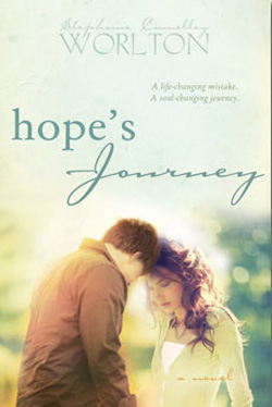
When someone calls something breathtaking, they don’t usually mean the lost their breath, but when I saw this cover for the first time, I literally stopped breathing for a few seconds. It impressed me that much. First the title, Gifts and Consequences. The font work is exceptional. I love the choices on those, the little doo-dahs on Gifts make it light and fun and happy. But then there’s Consequences—heavy, difficult, maybe too much to bear. Can gifts really carry heavy consequences? It made me ponder. Then the central image of the man. He looks so tired, so burdened by life. I love that we can’t see his face, only his stooped shoulders. The overall dark and gloomy colors support that. But then there are the daisies—that little hint of yellow. It made me feel that even in the most difficult of times, hope cannot completely be erased. Beautiful, beautiful cover work. Inspiring all by itself. I made the mistake of not buying the book right away and now it’s temporarily unavailable. Cannot wait until it’s back up for sale later this month. I will be getting it. I have to know the story behind that image. Have to. (And Daniel, do NOT mess with that cover! IF it comes back with a different cover, I will not buy it!)

Publisher:
B10 Mediaworx
Cover Design: Adam K. K. Figueira
Another cover where I love the symbolism. The story of Mary Magdalene is one of a fallen woman redeemed, of something beautiful being created from the trials of life. I assume that by using the title Magdalene, we are to recall that and apply it to this story. It certainly fits the cover image—an item of great beauty (the rose) being created by the forge of heaven. I absolutely love it. The black background makes it pop. I love how the molten steel (gold?) is so hot it turns bright white just before it becomes the rose. That is an image for earthly trials, isn’t it? I probably would have done something different with the title font, maybe a script, but as it is, it’s plain enough that your eye can ignore it if you choose to. Great imagery; great work.
Publisher: Torrey House Press
Cover Design: Jeff Fuller, Crescent Moon Communications
This cover absolutely fits the title. The image above the blue line is what I think of when I think of Moab—all those cave paintings. I don’t love the landscape below the blue but I like that it’s a different shade of brown. The thing that I love most about this is that blue line. It’s so attractive and provides both a base for the figure to stand on and a sense of sky above the landscape. Every time I scroll through the LDS Fiction site, I have to stop and just look at this one. Good work.
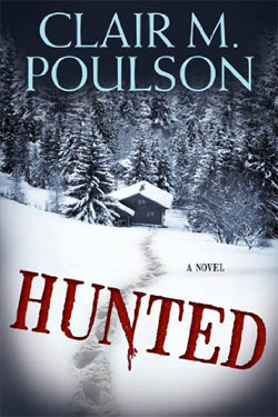
Publisher: Cedar Fort
Cover Design: ??
I love the colors in this image. Beautiful, vibrant. A patchwork, like the earth when seen from an airplane. I like that the pieces of that building don’t line up, that it’s “shaken.” And I like the solidness of the the title fonts—definitely not shaken. This is so intriguing. I first saw it at the bookstore and had to do a double take. Love it.
Publisher: Cedar Fort
Cover Design: Danie Romrell
There is something so sweet and lovely about this cover, and a bit ethereal—as is a new baby from heaven. I love the image of the baby. I love the lace work at the bottom. I love the color used in the title font. Every time I see it, it just makes me go, “awwwwwwww”. Cute!