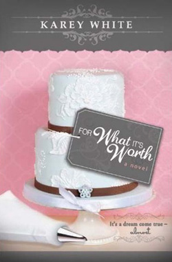
Please vote for your favorite cover using the poll at the bottom of the post.
Remember: Vote for the COVER, not the story or the author.
Voting deadline: Midnight, Saturday, January 26, 2012.
*These are for adult speculative fiction. YA comes next. And yes, there are six covers for you to vote on. It was too hard to narrow it down any more than that.
Speculative is quite possibly my favorite cover category, just because you can go absolutely crazy with it. It was fun looking at all of these covers.
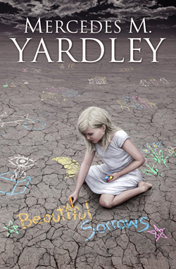
Beautiful Sorrows by Mercedes M. Yardley
Publisher: Shock Totem Publications
Cover Designer: Yannick Bouchard
This cover is a juxtaposition of sweet and innocent, with scary creepiness. First, the illustration of the young girl is haunting and beautiful. I love it. And she’s drawing with chalk. So sweet. So innocent. But then, you read the title. And you see the cracked and barren land she’s drawing on. And then you see the storm clouds gathering… it gives me a delicious shiver. I loved it. This is probably my second favorite cover in this category.

Dispirited by Luisa M. Perkins
Publisher: Zarahemla Books
Cover Designer: Jason Robinson
A great haunting cover. This is one of the few times that I think a black and white image really works. That photo gives you the long lonely road, barren trees, creepy house. While Beautiful Sorrows made me shiver, this one makes me shudder! I can hear the ghostly moans just looking at it! And the title is yellow. Great choice. This one wins for me because the stark imagery of it absolutely captures the essence of a scary, horror, demony, ghost story.
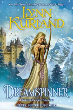
Dreamspinner by Lynn Kurland
Publisher: Berkley Trade
Cover Designer: George Long
(Artist: Dan Craig)
I picked this one for the classic fantasy look of it. Snow covered mountains, castles, forest, and a strong main character front and center. I love the blues and golds. Great speculative/fantasy look.

Murders in Whitechapel by Kindal Debenham
Publisher: Wandering Leaf Publishing
Cover Designer: Robert Ennis
Steampunk and creepy doll murder. Yes! This image is just so…creepy! I mean, is that blood on that doll’s dress?!? I like the smashed lens in those glasses. I want to know the story behind it. I even like the blue brickwork in the background. The only thing I don’t like is the series title so prominent and the book title so small, in relationship to each other. I’d probably have gone with only two lines on the series title, and a much larger book title. And that font choice is difficult to read. But the image…cool!
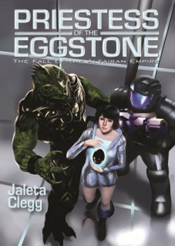
Priestess of the Eggstone by Jaleta Clegg
Publisher: JournalStone
Cover Designer: Denise Daniel
(Artist: Philip Renne)
Another nod to the classic imagery—this time sci-fi. I have no idea what this book is really about but I love the images. The monsters, the girls outfit, the gray square space-ship type walls behind them. Very, very good! The title is just right. (I like it when the book title is more of the focus than the series title). I like the sci-fi look to the font. Good cover.

Rock Band Fights Evil (#2) by D.J. Butler
Publisher: D.J. Butler
Cover Designer: ??
I totally love this cover! I mean, what’s not to love, right? You’ve got the windblown hair and monster fighting costume of the main character. An oversized sword. A many-tentacled monster. And the title? I love it!! I also love that bright blue background and all the swirly smoke at the bottom. This has a sort of tongue-in-cheek feel to it. I’d expect a very modern, demon-hunting story line. Love it!
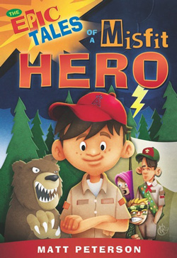 The Epic Tales of a Misfit Hero by Matt Peterson
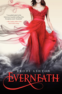 Everneath by Brodi Ashton