Please vote for your favorite cover using the poll at the bottom of the post.
Remember: Vote for the COVER, not the story or the author.
Voting deadline: Midnight, Saturday, January 26, 2012.
*These are covers that feature something other than the character’s face as the central design.
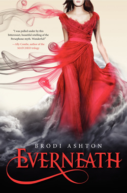
Publisher: Balzer + Bray
Cover Designer:
This book came out in January 2012. I remember when I first saw it, it took my breath away! I couldn’t stop looking at it. I thought then that it would take a pretty exceptional cover to boot this one out as my overall favorite. And I was right. Okay, here’s what got me: 1) Color. Red and black, startling and captivating at the same time. And it’s not against the usual white background, but a creamy one. For me, that cream background make the red and black even more compelling. 2) The Image. Oh. My. Gosh! Look at that dress!! It swirls and curls all over, turning from red to grays. And the bottom of it looks like it’s turning into those roiling clouds of black and smoke. Like the girl is dissolving into the darkness below her. 3) The Title Font. Again, red. And gorgeous! And a work of art with that swirl. And…I just love, love, love it. And the author’s name? It’s there but it’s not at all obnoxious. I don’t even mind the little blurb because it fills up the space, and yet I can totally ignore it if I want to. And now, a FULL YEAR LATER, I still love this cover!!! Oh, and why does this book fit this category, rather than the character category? Because of the red dress. That’s the central image, not her face.
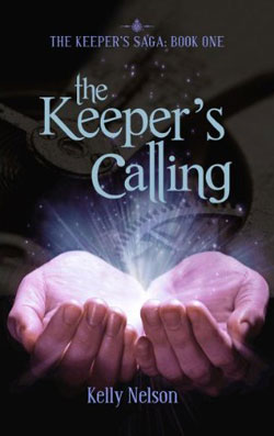
This cover got a lot of nominations, which is why it’s here. Not that it doesn’t have some good things about it, I’m just not sure it would have made my list here because there are soooo many phenomenal covers in both YA speculative categories. But here is what I do like about this cover: the light coming out of the hands. That gives us the speculative feel. I also like that gear or cog or whatever in the background. I don’t know if this book has steampunk aspects to it, but it feels like it does. I also like the way the series title is minimized, while the book title is featured. I think that’s a good choice for the first book in a series by a lesser known author.
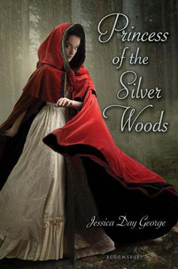
Publisher: Bloomsbury USA Childrens
Cover Designer:
Again, RED! Red seems to be a theme this year—or at least color. The title font is okay. The font for the author’s name feels a little dated to me. The image is okay. But that red cloak. Yep. That is going to grab the eye of every YA-reading female that walks past it. For sure.

I love the sci-fi feel of this cover. Everything about it gives you that feeling. The shading in the title font makes it pop out—high chrome. I have know idea what that star thingee is, but I love it. It contrasts well with the other colors, making it pop. I like the way it’s cutting into the white thingee and makes it look like it’s bleeding. Love it!

Publisher: Simon Pulse
Cover Designer:
Cover Designer:
An example of when less is more. I love the simplicity of this cover. I love the teal. The simplicity of the fonts. I love the image of the humingbird in the jar. I love the whole understatement of it. Very, very cool!
One thought on “2012 YA Speculative Covers: Other”
Comments are closed.