Please vote for your favorite cover using the poll at the bottom of the post.
Remember: Vote for the COVER, not the story or the author.
Voting deadline: Midnight, Saturday, January 26, 2012.
*Note: This is the category for lighter romance or romantic comedies.
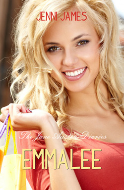
Publisher: Walnut Springs
Cover Designer: ??
I love this image of the main character looking right at you. She’s fresh, clean, clear, as are the colors of her dress, hair, even the shopping bags she’s carrying. This is exactly what a light comedic romance should look like. The downside to this one is the author’s name looks like it’s been tattooed on her forehead, and the title—even as big as it is—gets lost. And the series title totally disappears. And yet, that fresh, sweet face makes me look every time!
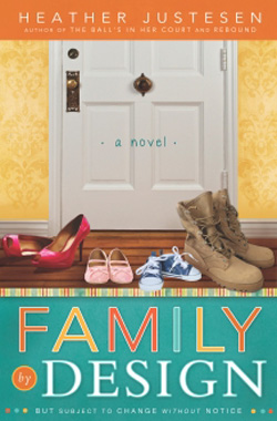
Publisher: Cedar Fort
Cover Designer: Angela Olsen
This cover got a lot of reader nominations. I like the colors of it. I like the simpleness of the font, and how that blue at the bottom grounds it. But I think the image is too tightly framed. It feels like it’s being squeezed. And it’s a busy cover. Sometimes busy is good, but sometimes my eye flits around too much and doesn’t now where to land. For me, this is a little bit too much.
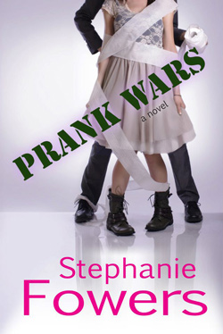
Publisher: Triad Media and Entertainment
Cover Designer: Jacqueline Fowers
This cover is just so fun! You can tell right away by the image that this is a romantic COMEDY. It’s fun. I like the softer background. Personally, I’d probably put the title at the bottom in the bright pink. Stamping it across the image is a little too distracting for me. Not sure where I’d put the author’s name—maybe up at the top. And there’s room to the left for a little blurb. But I do love that basic image. It’s awesome!
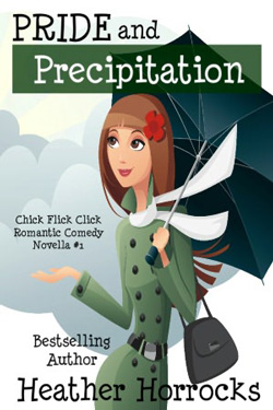
Publisher: Word Garden Press
Cover Designer: ??
I really like this style of cover for romantic comedies. It’s cute, attractive, and whimsical. Sets the tone of the story and I feel like I know what to expect from the book. In this cover, I like the way the colors work together to set a mood. I might have changed out the font for the author, just so there’s a little variety in the text. But very good main image.
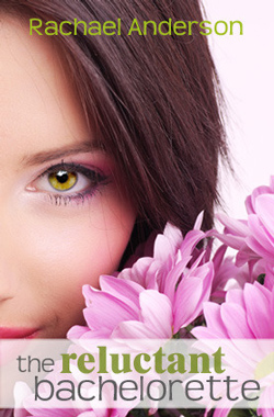
Publisher: HEA Publishing
Cover Designer: ??
I love this cover! You have an intriguing cover model. In this one, that half-face trend works for me. I love those big flowers in the image. Very, very good and solid and expresses the mood and feel of a lighter romance. And it’s pink! Yay! The author’s name is visible but not distracting. And I love the way the title is set off, in that pink shaded box that doesn’t block out the image behind it. I also like the fonts—the clean but quirky “bachelorette” with “reluctant” emphasized both by font choice and color. This cover is the epitome of light romance. Very good job!
Cool my cover is on there! I think Rachel Anderson did her own cover. She has a real eye for fonts, doesn’t she?