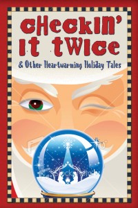
We talked about your responses both here and on Facebook—Thank you!—and came up with this:
Click to enlarge.
Here’s our thinking:
1. We want it to visually feel like our previous book, therefore, keeping the frame. Also, we feel like some of the commenters—our eyes fall off the edge of the book just under the title in the non-framed version and we never make it back to the globe with the nativity. The frame sort of makes your eyes bounce back to the center and the globe.
2. Font choice for title is the same as our first book, so we want to keep that but we made it more readable. (We also got the title correct this time.) (Oh, and ignore the weird spacing before the letter “t” and those extra dots. Those will come out in the final version.)
3. We did change the font on the subtitle and moved it up. There’s just no good place to put it at the bottom of the framed version. Yes, we know it will be difficult to read in thumbnail size, but it’s a subtitle so that’s okay.
4. We really want a Santa AND Savior cover because it goes with the message of the lead story, “Checkin’ It Twice”. There’s not a lot out there that’s cute and has reasonable royalty fees. (Reasonable = we’re working on a shoestring here.)
5. As to the “creepy” Santa face…ummm…we thought he was cute. But we will make his eye all green. That brown/green combo is a little on the weird side.
So. What do you think? Better?

I like it, though I didn’t realize at first that he was Santa.
The title is much more readable now. Much better. 🙂
Much better! I like it. 🙂
I really like how you added more spacing between letters. That makes it a lot more readable, since you want to keep the same font. I never thought the Santa was creepy (just crafty), but it is hard to tell its him with only a little corner of red suit showing. And can people tell it’s a snow globe without seeing the base? Maybe you could shift the whole picture up and put the subtitle back in the snow globe base? Right now the white at the top looks way to thick to be Santa’s hat.
I know pleasing everyone and design in general is really hard, so I think you are doing a great job! You asked for feedback though, so feel free to take it or leave it. I’m so excited about the book! I really love that it has Santa and the naivety. And I like the bright, bold, classic colors. Lovely!